Web based School


6 — Code Reuse with the Component Gallery
6 — Code Reuse with the Component Gallery
One of the great promises of object-oriented programming is improved code reusability. The Visual C++ development system goes a long way towards realizing this promise by providing a repository for reusable code components, the Component Gallery.
One of the nice things about the Component Gallery is that it isn't empty; like Santa's stockings, it is filled with a variety of goodies that are ready to be used with your applications. Examples include reusable components that add clipboard support, splash screen functionality, a password dialog, palette support, and many other features to your programs.
The Component Gallery
The Visual C++ Component Gallery is a repository of a variety of standard and user components. What is a component? A component can be a class complete with its header file, implementation file, and resources; it can also be an OLE control. It can also be a "smart" component supplied by Microsoft or a third party vendor.
The Component Gallery provides a facility to store and manage these components.
Inserting a Component into a Project
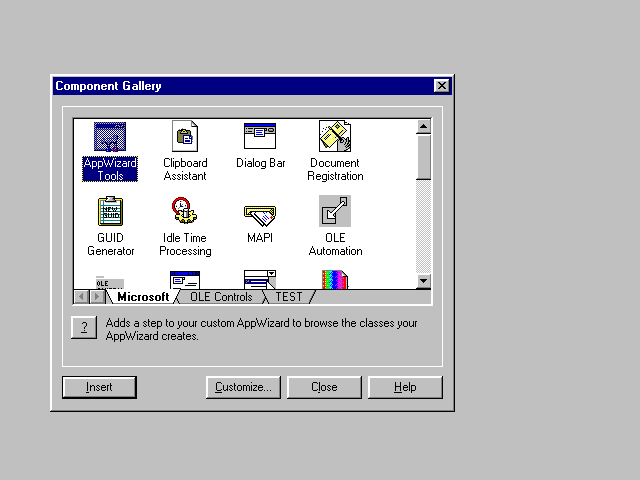
The Component Gallery is invoked through the Component command in the Developer Studio's Insert menu. It appears in the form of the Component Gallery dialog box (Figure 6.1).
Figure 6.1. The Component Gallery.
Installable components are shown using a series of tabbed panes. The Microsoft and the OLE Controls tabs are added when the Component Gallery is installed; other tabs are added automatically or manually when components from your own projects are added to the Component Gallery.
To add a specific component to your project, select the component, and click on the Insert button. If you wish to receive more information about the component before adding it to your project, click on the Help button (the button marked with a question mark).
Many standard components display configuration dialogs when you select them for insertion. Components may also examine your application's source code to determine whether the selected component is compatible with your application.
Creating Your Own Components
As you work with Visual C++, you develop many components that are potential candidates for reuse. For example, you may create a splash dialog, a CDocItem-derived class of document objects, or a customized About dialog with your company's animated logo; all of which are reusable components.
Adding these components to the Component Gallery is easy; in fact, often you do not have to do anything; adding these components is accomplished automatically. When you create a new project through AppWizard, all the new classes created by AppWizard are automatically added to the Component Gallery.
When you create a new class through ClassWizard, you can also specify whether the new class is to be added to the Component Gallery. To do so, make sure the Add to Component Gallery checkbox in the Create New Class dialog is set (it is set by default). When you create the new class, it is automatically added to the Component Gallery.
Unfortunately, I know of no way to add an existing class to the Component Gallery. However, there is a relatively easy workaround; you can make a copy of the class, remove it from your project, and create it again through the ClassWizard, this time with the Add to Component Gallery checkbox set. When you are done creating this new class, you can copy your old code over the newly created files.
When you are adding a class that is associated with a dialog template (for example, a class derived from CDialog), create the dialog template before you create the class through the ClassWizard. This way, you ensure that the class is properly associated with the dialog template and that the dialog template is part of the component that is added to the Component Gallery.
When a class from your project is added to the Component Gallery, what is actually added is a reference to the files comprising the class. This way, any changes to the class are reflected immediately in the Component Gallery. This also means, unfortunately, that if your project is moved, the contents of the Component Gallery may no longer be valid.
When classes from a project are added to the Component Gallery by AppWizard, a new category of components is created, represented by a new pane in the Component Gallery. You can manipulate these categories, move components between categories, add and remove categories to the Component Gallery, and rename categories and components using the Component Gallery's customization feature. To invoke the Customize Component Gallery dialog (Figure 6.2), click on the Customize button.
Figure 6.2. The Customize Component Gallery dialog.
This dialog also lets you view and possibly modify component properties. Selecting a component and clicking on the Properties button invokes that component's property sheet. Most importantly, you can use the General page of the component's property sheet (Figure 6.3) to change the description of a component or to add a description to a custom component.
Figure 6.3. Adding a description to a custom component.
Custom components are limited to simple classes or classes with associated dialog templates. At present, Microsoft has announced no plans to publish the interfaces for creating "smart" components; that is, components that can present a user interface prior to insertion, provide customized property pages, and obtain information about the project. Hopefully, this information will become available with a future release of Visual C++.
Exporting a Component
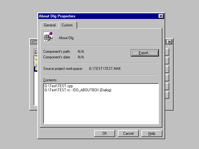
The ability to add components to the Component Gallery is a great reusability feature; however, the concept of reusability is not limited to a single computer. In order to facilitate sharing components between users, the Component Gallery provides an Export feature for custom components.
To invoke this feature, open the Component Gallery, click on the Customize button, select the desired custom component, and click on the Properties button. In the component's property sheet, select the Custom property page (Figure 6.4). Click on the Export button. The Component Gallery will respond by requesting a filename; by default, exporting components have the .ogx filename extension.
Figure 6.4. Exporting a custom component.
Importing a Component
An exported component can be imported using the Component Gallery's Import feature. To use this feature, invoke the Customize Component Gallery dialog and click on the Import button.
The Import feature can be used to import two types of components; components that were exported earlier (OGX files), and OLE controls (OCX files). When you are importing a component, you are given the choice of either copying the files to the msdev\template directory or not. If you do not copy the file, the component added to the Component Gallery will be a reference to the file at its original location. Needless to say, removing the file will also invalidate the component in the Component Gallery.
Note that when an OLE control is registered, it is automatically added to the Component Gallery.
Standard Components
The Visual C++ development system comes equipped with a variety of standard components. These components can be used to add specific features to your application. In the remainder of this section, I present a few notes about some of these components that I found most useful.
Clipboard Assistant
The Clipboard Assistant component adds basic clipboard functionality to your project. It does so by adding a series of message handlers to the selected class (by default, your application's view class) that implement the cut, copy, and paste commands. Clipboard support can be added for edit controls, rich-text controls, or for an application-specific custom format.
Dialog Bar
The Dialog Bar component can be used to add a dialog bar to a frame window in your project. This component adds a dialog bar object of type CDialogBar to the designated frame window. It also creates a dialog template resource for the dialog bar.
Figure 6.5 shows a dialog bar added to a child window using the Dialog Bar component.
Figure 6.5. Child window with a dialog bar.
Palette Support
The Palette Support component adds handlers to the selected window class for WM_QUERYNEWPALETTE and WM_PALETTECHANGED messages. It also adds a SetPalette member function to the designated window. Subsequent changes to the palette can be accomplished by simply calling SetPalette; the palette will be remembered and properly restored when the window regains focus.
Popup Menu
The Popup Menu component adds popup menu support to the selected class. The popup menu is invoked when the user clicks on the window that the class represents using the right mouse button.
The component adds two member functions, OnContextMenu and PreTranslateMessage; it also creates a new menu resource with three default commands, Cut, Copy, and Paste (note that the component does not supply the implementation for these commands).
Splash Screen
The Splash Screen component adds a splash screen to your project. The splash screen is displayed when the application starts. This component adds a new class to your application (CSplashWnd) and also a bitmap resource (IDB_SPLASH) that you can customize.
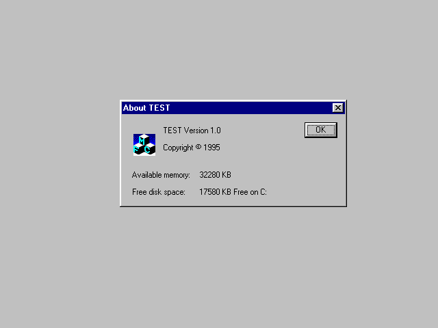
System Info for About Dialog
The System Info for About dialog component modifies your application's About dialog implementation to include system information. It adds an OnInitDialog member function to your application's About dialog class; you must manually add two static controls to your About dialog (Figure 6.6) and modify the code in OnInitDialog to update these controls.
Figure 6.6. About dialog with system information.
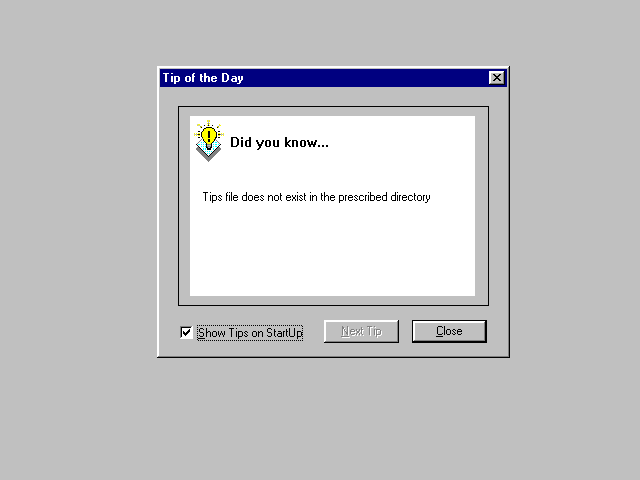
Tip of the Day
The Tip of the Day component adds a Tip of the Day dialog (Figure 6.7) to your project. The dialog is added in the form of a header file (TipDlg.h), implementation file (TipDlg.cpp), and dialog template IDD_TIP. The component also modifies the InitInstance function of your application class to invoke the Tip of the Day dialog when the application is started. The Help menu is also updated to provide a Tip of the Day command.
Figure 6.7. Tip of the Day dialog.
Summary
The Component Gallery is a repository of standard and custom components. A component is a class, an OLE control, or a "smart" component from Microsoft or a third party vendor.
To add a component to your application, select the desired component in the Component Gallery and click the Insert button.
You can create your own components that are to be added to the Component Gallery. All classes of a new AppWizard-generated project are automatically added to the Component Gallery. You can also specify that a new class created through ClassWizard be added to the Component Gallery by checking the appropriate box in the Create New Class dialog. Although no facility exists to add an existing class to the Component Gallery, you can easily create a dummy class that is compatible with your existing class, add it to the Component Gallery, and then copy code from your existing class into it.
The customization feature of the Component Gallery enables you to arrange component categories and components. It also lets you export an existing component so you can give it to other users. To import an exported component or an OLE control use the Component Gallery's import feature.
The Visual C++ development system comes equipped with a series of standard components. These include components for adding clipboard support, support for dialog bars, palettes, popup menus, a splash screen component, a Tip of the Day component, About dialog enhancements, and much more. You can also add classes representing registered OLE controls through the Component Gallery.
Popular Tutorials
-
 MS Access
1109
MS Access
1109
-
 C++
1222
C++
1222
-
 HTML
584
HTML
584
-
 JavaScript
616
JavaScript
616
-
 Vbscript
873
Vbscript
873
-
 Oracle
473
Oracle
473
-
 VC++
875
VC++
875
-
 SQL
2959
SQL
2959
-
 XML
514
XML
514
-
 Java
814
Java
814
-
 Perl
455
Perl
455
-
 Linux
451
Linux
451


