Web based School


- 22 — MFC Support for Common Dialogs and Common Controls
22 — MFC Support for Common Dialogs and Common Controls
22 — MFC Support for Common Dialogs and Common Controls
The Microsoft Foundation Classes Library provides extensive support for common dialogs and the new Windows 95 common controls.
Common dialogs have been a feature of Microsoft Windows since Version 3.1. They are used for opening and closing files, selecting colors and fonts, performing text searches, and setting up and using the printer. Use of these dialogs has never been particularly difficult; unless extensive customization was required, it usually involved populating the members of a C structure, invoking the common dialog, and processing the user's selection. The MFC Library makes it even easier by automating the construction of the necessary structures. The common dialog classes of MFC also make customization easier.
Windows has always provided support for a small selection of standard controls, such as edit controls, static controls, or buttons. The new Windows 95 common controls represent a powerful new set of controls that can be used to enhance the appearance of applications. MFC 4 now provides complete class support for these new controls and integrates them with other MFC framework features where applicable.
Common Dialogs
MFC support for common dialogs is provided through classes derived from the class CCommonDialog, which is itself derived from CDialog. You would never derive a class from CCommonDialog directly or create a CCommonDialog object. Instead, to use a common dialog, you create an object of the appropriate dialog class; or, if you use a customized common dialog template, you derive a class from that dialog class.
The set of classes in MFC that provide common dialog support is shown in Figure 22.1.
Figure 22.1. Common dialog support in MFC.
In case of an error, many common dialogs provide extended error information. This information can be retrieved by calling CommDlgExtendedError.
In the following sections, we take a brief look at every one of the common dialog classes provided by the MFC Library. In order to do this, we are going to use an AppWizard-generated application skeleton. This application, CDLG, can be created as an SDI application with AppWizard defaults. We use its View menu for additional commands that invoke the various dialogs. However, to avoid being repetitive, I do not mention separately the creation of a menu command in CDLG's View menu for every common dialog.
CColorDialog
The CColorDialog class supports the Windows color selection common dialog.
To display a color dialog, construct a CColorDialog object and call its DoModal function. Before calling DoModal, you can initialize the dialog by setting up the m_cc member of CColorDialog, which is a Win32 structure of type CHOOSECOLOR. Once the dialog has been dismissed, the user's color selection can be retrieved by calling the GetColor member function.
Listing 22.1 shows a possible implementation of a color selection dialog using the CColorDialog class.
void CMainFrame::OnViewColordialog()

{

    // TODO: Add your command handler code here

    CColorDialog dlg;

    if (dlg.DoModal() == IDOK)

    {

        char temp[100];

        wsprintf(temp, "Color selected: %#8.8X", dlg.GetColor());

        AfxMessageBox(temp);

    }

}
You can also customize the color selection dialog. To do so, derive your own class from CColorDialog and supply a custom dialog template. The Windows color selection dialog template can be found in the file color.dlg in your msdev\include directory. If you add any new controls, you may wish to add a message map to your new class to process notification messages from the new controls.
CFileDialog
The CFileDialog class provides support for the Windows Open and Save As dialogs.
To use a file dialog in an MFC application, you should first construct a CFileDialog object. The constructor takes several parameters; the first parameter is a mandatory Boolean value that determines whether the dialog is an Open or a Save As dialog. Once the dialog has been constructed, call its DoModal member function to display it.
Most common initialization settings for this dialog can be specified in the CFileDialog constructor. You may also set the values of the m_ofn structure; this is a Win32 OPENFILENAME structure. When the dialog terminates, the user's filename selection can be retrieved by calling the GetPathName member function. If the selection of multiple filenames was allowed, an iterator to the filename list can be obtained by calling GetStartPosition; individual filenames can be retrieved by repeatedly calling GetNextPathName with the iterator.
Listing 22.2 demonstrates the use of the Open dialog.
void CMainFrame::OnViewFiledialog()

{

    // TODO: Add your command handler code here

    CFileDialog dlg(TRUE);

    if (dlg.DoModal() == IDOK)

    {

        CString temp = "File selected: " + dlg.GetPathName();

        AfxMessageBox(temp);

    }

}
If you derive a class from CFileDialog, you can provide customized handling for conditions such as sharing violation, filename validation, and list box change notifications.
The file dialog can also be customized. To do so, derive a class from CFileDialog, add a custom dialog template, and add your message map to handle notifications from any new controls. The original file dialog template can be found in the file fileopen.dlg in your msdev\include directory.
CFindReplaceDialog
The CFindReplaceDialog class supports the use of the Windows Find and Replace dialog in MFC applications.
Use of the Find and Replace dialog is fundamentally different from the user of other common dialogs. While other common dialogs are modal, the Find and Replace dialog is modeless and must be constructed and used accordingly.
To use the Find and Replace dialog, first construct a CFindReplaceDialog object. This object cannot be constructed on the stack; it must be created using the new operator to ensure its persistence after the function in which it is created returns.
The Find and Replace dialog communicates with its owner window using special messages. To enable use of these messages, use the ::RegisterWindowMessage function. The value obtained upon registering Find and Replace dialog messages can be used in a window's message map using the ON_REGISTERED_MESSAGE macro.
The actual dialog is created by calling the Create member function. Make sure to specify the window that should receive messages from the dialog in the call to CFindReplaceDialog::Create.
Now you're ready to put all this into practice. Listing 22.3 shows how the use of the Find and Replace dialog is implemented in the CDLG application. All the code shown here is part of the MainFrm.cpp source file.
// MainFrm.cpp : implementation of the CMainFrame class

//

...

static UINT WM_FINDREPLACE = RegisterWindowMessage(FINDMSGSTRING);

///////////////////////////////////////////////////////////////////

// CMainFrame

IMPLEMENT_DYNCREATE(CMainFrame, CFrameWnd)

BEGIN_MESSAGE_MAP(CMainFrame, CFrameWnd)

    //{{AFX_MSG_MAP(CMainFrame)

    ...

    //}}AFX_MSG_MAP

    ON_REGISTERED_MESSAGE(WM_FINDREPLACE, OnFindReplace)

END_MESSAGE_MAP()

...

void CMainFrame::OnViewFindreplacedialog()

{

    // TODO: Add your command handler code here

    CFindReplaceDialog *pDlg = new CFindReplaceDialog;

    pDlg->Create(TRUE, "Findme", NULL, FR_DOWN, this);

}

LRESULT CMainFrame::OnFindReplace(WPARAM wParam, LPARAM lParam)

{

    if (((LPFINDREPLACE)lParam)->Flags & FR_FINDNEXT)

    {

        CString temp = "Search string: ";

        temp = temp + ((LPFINDREPLACE)lParam)->lpstrFindWhat;

        AfxMessageBox(temp);

    }

    return 0;

}
The function OnFindReplace must also be declared in MainFrm.h. Towards the end of the class declaration, after the ClassWizard-generated message map, but before the DECLARE_MESSAGE_MAP macro call, insert the following line:
afx_msg LRESULT OnFindReplace(WPARAM wParam, LPARAM lParam);
Customization of the Find and Replace dialog involves deriving a class from CFindReplaceDialog, providing a custom dialog template, and adding your own message map to process notification messages from any extra controls you added. The original dialog template can be found in the file findtext.dlg in your \msdev\include directory.
CFontDialog
The CFontDialog class supports font selection in MFC applications through the Windows font selection common dialog.
To use the font selection dialog, create a CFontDialog object and call its DoModal member function. Before calling DoModal, you can initialize the dialog by setting the values of the m_cf member of CFontDialog. This member is a structure of type CHOOSEFONT.
When the dialog returns, you can use CFontDialog member functions such as GetFaceName, GetSize, or GetColor to obtain information about the font selected by the user. Alternatively, you can examine the values of the m_cf structure. Of specific interest is m_cf.lpLogFont; upon return of CFontDialog::DoModal, this pointer points to a LOGFONT structure, which can be used in subsequent calls to ::CreateFontIndirect or CFont::CreateFontIndirect to create a logical font.
The use of CFontDialog is demonstrated in Listing 22.4.
void CMainFrame::OnViewFontdialog()

{

    // TODO: Add your command handler code here

    CFontDialog dlg;

    if (dlg.DoModal() == IDOK)

    {

        CString temp = "Font selected: " + dlg.GetFaceName();

        AfxMessageBox(temp);

    }

}
To use a customized font selection dialog, derive your own class from CFontDialog and create a custom dialog template. Add a message map to the new class to process notification messages from any new controls you might have created. As the basis of the dialog template, use the font selection dialog template font.dlg that can be found in your msdev\include directory.
CPageSetupDialog
The Page Setup dialog is used under Windows 95 and Windows NT 3.51 to set up the printed page. This dialog replaces the Print Setup dialog.
To use the Page Setup dialog, create an object of type CPageSetupDialog and call its DoModal member function. Information about the user's page setup preferences can be obtained through a variety of member functions, such as GetDeviceName, GetMargins, or GetPaperSize. Alternatively, you can examine the m_psd member variable (which is of type PAGESETUPDLG). It is also possible to modify members of this structure prior to calling DoModal in order to override default behavior.
Listing 22.5 shows an example of using the Page Setup dialog.
void CMainFrame::OnViewPagesetupdialog()

{

    // TODO: Add your command handler code here

    CPageSetupDialog dlg;

    if (dlg.DoModal() == IDOK)

    {

        char temp[100];

        sprintf(temp, "Paper size: %g\" x %g\".",

                (double)dlg.m_psd.ptPaperSize.x / 1000.0,

                (double)dlg.m_psd.ptPaperSize.y / 1000.0);

        AfxMessageBox(temp);

    }

}
It is possible to create a customized page setup dialog. To do so, derive a class from CPageSetupDialog, supply your own dialog template, and supply a message map to process notifications from any controls you might have added. The original dialog template for the Page Setup dialog can be found in the file prnsetup.dlg in your msdev\include directory.
If you derive your own class from CPageSetupDialog, you can override the member functions OnDrawPage and PreDrawPage to draw a customized version of the image of the printed page in the dialog. You can utilize this capability to render an image of a printed page that closely resembles a page printed by your application.
CPrintDialog
Although AppWizard-generated application skeletons provide printing and page setup capabilities, sometimes it is not possible to rely on AppWizard-generated code for this purpose. In this case, applications must explicitly utilize the Print, Print Setup, and Page Setup dialogs.
The CPrintDialog class supports the use of the Print and Print Setup dialogs in MFC applications. However, applications written for Windows 95, or Windows NT 3.51 or later should refrain from using the Print Setup dialog; they should instead use the new Page Setup dialog.
To create a Print dialog, construct a CPrintDialog object and call its DoModal member function. The first parameter of the constructor, a Boolean value, determines whether the dialog is a Print or Print Setup dialog; set this parameter to TRUE if you wish to use the Print Setup dialog.
The dialog can be initialized by setting the values in the m_pd member structure, which is a structure of type PRINTDLG. The user's printing preferences can be obtained through member functions such as GetDeviceName or GetPrinterDC.
The CPrintDialog class can also be used to obtain a printer device context corresponding to the default printer without displaying a dialog. Use the CreatePrinterDC function for this purpose. Note that this function overwrites any previously stored device context handles in m_pd.hDC without actually deleting the device context object.
The device context object must be deleted not only when it has been created by a call to CreatePrinterDC, but also when CPrintDialog has been constructed for a Print dialog (with the first parameter of the constructor set to FALSE). Applications must also delete any DEVMODE and DEVNAMES structures supplied by CPrintDialog by calling the Windows function GlobalFree for the handles m_pd.hDevMode and m_pd.hDevNames.
Listing 22.6 shows how a Print dialog is created in the CDLG application.
void CMainFrame::OnViewPrintdialog()

{

    // TODO: Add your command handler code here

    CPrintDialog dlg(FALSE);

    if (dlg.DoModal() == IDOK)

    {

        CString temp = "Device selected: " + dlg.GetDeviceName();

        AfxMessageBox(temp);

    }

    GlobalFree(dlg.m_pd.hDevMode);

    GlobalFree(dlg.m_pd.hDevNames);

    DeleteDC(dlg.GetPrinterDC());

}
It is possible to customize the Print and Print Setup dialogs. To do so, derive a class from CPrintDialog, create a custom dialog template, and add a message map to process notification messages from any new controls. Use the dialog templates in the file prnsetup.dlg in your msdev\include directory as the basis for any new dialog template you create.
Note that if you want different class behavior depending on whether the Print or Print Setup dialog is displayed, you may have to derive to separate classes from CPrintDialog.
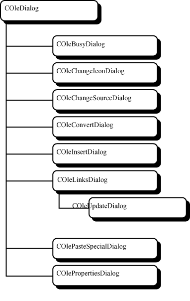
COleDialog
OLE supports several additional common dialogs. These common dialogs are also supported by the MFC Library through a series of dialog classes. The class COleDialog serves as the base class for all OLE common dialog classes.
Figure 22.2 shows the set of OLE common dialogs.
Figure 22.2. OLE Common dialogs in MFC.
Common Controls
The MFC provides a wrapper class for each of the new Windows 95 style common controls. Many of these controls can now be constructed using the dialog editor within the Developer Studio. Assigning an object of the appropriate control class to a newly created control is often simply a matter of creating a member variable through ClassWizard.
In our tour of Windows 95 controls, we are going to use a simple application to demonstrate control usage where applicable. This application, which I named CTRL, is based on an AppWizard-generated application skeleton (dialog-based) with all the standard settings. This application demonstrates the use of sliders, progress bars, hot keys, spin buttons, list controls, tree controls, animation controls, and tab controls. The tab control is used to implement a tabbed dialog by hand; something you would not normally do when you can use property sheets, but it serves as a perfect demonstration of the tab control's capabilities.
Animation Control
The animation control is a control that can display simple AVI format video files. You can create an animation control in a dialog using the dialog editor in Developer Studio. You can then use the ClassWizard to assign a member variable of type CAnimateCtrl. It is typically not necessary to derive your own class from CAnimateCtrl.
To load a video clip into an animation control you should call the CAnimateCtrl::Load member function. This function accepts either a filename or a resource identifier as its parameter. For example, in the CTRL application, I added an AVI file as a custom resource in an external file, and assigned to it the text identifier "VIDEO". Afterwards, in the CTRL dialog's OnInitDialog member function, I made the following function call:
m_cAnimate.Open("VIDEO");
Unless the animation control has been created with the auto play style, you have to start playback by calling the CAnimateCtrl::Play member function. By setting the appropriate parameters of this function, you can specify the starting and ending frame, and the number of times the clip should be replayed. To play back the entire clip and repeat playback continuously, I used the following call to this function in CTRL:
m_cAnimate.Play(0, -1, -1);
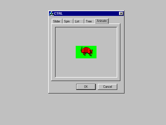
Figure 22.3 illustrates the animation control in the CTRL application.
Figure 22.3. Animation control in the CTRL application.
Header Control
The header control is used to create column headers for columnized lists. This control is most frequently encountered as part of list controls in report view. For example, the list control in Figure 22.5 contains a header control.
If you wish to create a header control on its own, you can use the CHeaderCtrl class for this purpose. To create the actual control, call this class's Create member function. To add items to the header control, call CHeaderCtrl::InsertItem.
If the header control is placed inside a view window, you would typically perform these initializations in the view object's OnInitialUpdate member function.
A header control cannot be added to a dialog using the dialog editor in Developer Studio. If you wish to use a header control in your dialog, add a member variable of type CHeaderCtrl to your dialog class manually, and initialize the header control in your dialog's OnInitDialog member function.
Hot Key Control
A hot key control is a special edit control; it accepts single keystrokes, displays a symbolic representation of the keystroke (for example, Alt+Shift+F1), and returns the virtual key code and shift codes corresponding to the key. It is typically used in conjunction with the WM_SETHOTKEY message to associate a hot key with a window.
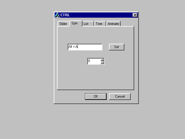
The use of the hot key control is demonstrated in the CTRL application (Figure 22.4). When the user selects a hot key and clicks the Set button, a WM_SETHOTKEY message is sent to the dialog window; subsequently, any time the user types the selected key, the CTRL dialog is activated.
Figure 22.4. A hot key control and a spin button in CTRL.
A hot key control can be added to a dialog using the Developer Studio dialog editor, and a corresponding object of type CHotKeyCtrl can be created as a member variable of the dialog class using ClassWizard.
The hot key's current setting is usually retrieved when the user indicates that the selection is complete, for example, by clicking on a button. In the CTRL application, the Set button serves this purpose. The value of the hot key can be retrieved by calling the member function CHotKey::GetHotKey; the DWORD value returned by this function can be used in a subsequent call to SendMessage as the WPARAM parameter of a WM_SETHOTKEY message. Listing 22.7 illustrates this usage in the CTRL application.
void CCTRLDlg::OnButton()

{

    // TODO: Add your control notification handler code here

    SendMessage(WM_SETHOTKEY, m_cHotKey.GetHotKey());

}
The hot key control can also be used in conjunction with the Win32 function RegisterHotKey to set up thread-specific hot keys.
List Control
A list control presents a collection of items, each identified by an icon and a label. Items in a list control can be arranged in a variety of ways. In Icon View, items appear as large icons with text underneath and can be dragged anywhere in the control. In Small Icon View, items are displayed as small icons with text to the right and can be dragged to any position. In List View, items appear in columnar form as small icons with text to the right, and their position cannot be altered. In Report View, items are presented in multiple columns, with subitems occupying the columns right of the first columns.
The MFC supports list controls in two ways. The CListView class can be used to create a view window with a list control occupying the entire client area. For other uses of list controls, including use of list controls in dialogs, you can use the CListCtrl class. If you wish to add a list control to a dialog, you can do so using the Developer Studio dialog editor.
Construction of a list control is a multiple step process. It involves the creation of the list control, the setting up of its columns by calling the InsertColumn member function, and the insertion of list control items by calling InsertItem.
The icons associated with items must be supplied in the form of an image list. Image lists represent a collection of small graphic items of identical size. Support for image lists in MFC is provided in the form of the CImageList class.
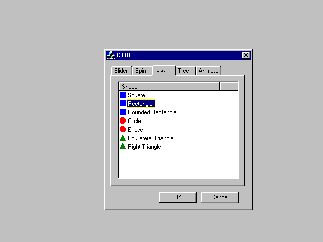
Figure 22.5 shows the use of a list control in the CTRL application. The list control in the dialog template has been configured for Report View and single selection.
Figure 22.5. A list control in CTRL.
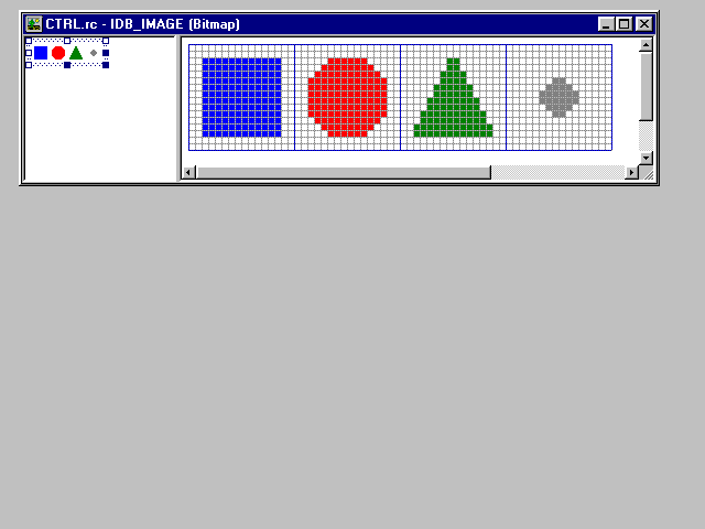
The bitmap that is used in the list control consists of four images, 16 by 16 pixels each. This bitmap is shown in Figure 22.6.
Figure 22.6. Bitmap of list control icons.
To manage the list control in CTRL, I used the ClassWizard to create a member variable of type CListCtrl in my dialog. The list control is then initialized in OnInitDialog, as show in Listing 22.8.
m_cImageList.Create(IDB_IMAGE, 16, 10, 0);

m_cList.InsertColumn(0, "Shape", LVCFMT_LEFT, 200);

m_cList.SetImageList(&m_cImageList, LVSIL_SMALL);

PSTR pszListItems[] = {"Square", "Rectangle", "Rounded Rectangle",

                       "Circle", "Ellipse", "Equilateral Triangle",

                       "Right Triangle", NULL};

int nListTypes[] = {0, 0, 0, 1, 1, 2, 2};

for (int i = 0; pszListItems[i] != NULL; i++)

m_cList.InsertItem(i, pszListItems[i], nListTypes[i]);
When processing the results of the user's selection in a list control, the state of an item can be obtained by calling the member function CListCtrl::GetItemState.
Progress Bar
A progress bar is used to provide graphical feedback to the user about progress during a lengthy operation. It is different from other controls inasmuch as its sole purpose is to provide information to the user; it does not accept input of any kind.
To use a progress bar in a dialog, insert a progress bar control using the Developer Studio and assign a member variable of type CProgressCtrl to it using ClassWizard. Initialization of the control consists of setting up the minimum and maximum value and, optionally, the control's current position. When using the control in a dialog, this can be done in the dialog class's OnInitDialog member function.
Figure 22.7 shows the use of a progress bar in conjunction with a slider control in CTRL.
Figure 22.7. A progress bar and a slider control in CTRL.
The initialization of the progress bar in CTRL's CCTRLDlg::OnInitDialog is shown in Listing 22.9.
m_cProgress.SetRange(1, 100);

m_cProgress.SetPos(1);
The position of the progress bar can be set by calling the SetPos member function.
Rich-Text Edit Control
The rich-text edit control, or RTF control, vastly enhances the capabilities of the standard Windows edit control. RTF controls display and manage formatted text.
Rich text edit controls present a complex programming interface, which is reflected in the numerous member functions of the classes supporting this type of control. In fact, the MFC Library offers a total of four classes in connection with this control.
Simple support for rich text edit controls is provided via the CRichEditCtrl class. However, the MFC Library also supports applications with documents based on rich text control capabilities. Such support is provided through the classes CRichEditDoc, CRichEditView, and CRichEditCntrItem.
Rich edit controls can be viewed as controls providing a superset of the capabilities of multiline edit controls.
Text in a rich edit control can be assigned character and paragraph formatting. Formatting of text within a rich edit control represented by a CRichEditCntr object can be accomplished by calling the SetSelectionCharFormat, SetWordCharFormat, and SetParaFormat member functions of the control class. The rich edit control does not provide a user interface for text formatting; the application must implement the user interface in the form of menus, toolbars, and other user-interface controls.
Rich edit controls can also support clipboard, OLE, printing, and file operations. Rich edit controls can load and save text in both text (ASCII) and rich text format.
Use of a rich edit control in an MFC application is demonstrated by the Windows 95 WordPad application. As a minor miracle, Microsoft decided to release the source code for this application in its entirety to developers. (We are talking about production quality source code here, not some Mickey Mouse implementation like my three-liner examples!) This application provides an excellent reference for anyone wishing to utilize a rich edit control in an MFC application.
Slider Control
Slider controls, also called trackbars, are often compared to the sliding volume controls on stereo equipment. In this facility, they provide a replacement for the dubious practice of using scrollbars for this purpose (for lack of anything better).
Slider controls are supported in MFC through the CSliderCtrl class. If used in a dialog, a slider control can be inserted into the dialog template using the Developer Studio dialog editor. Next, create a corresponding member variable in your dialog class using ClassWizard. Through this member variable, the slider control can be initialized in your dialog class's OnInitDialog member function. Initialization includes setting up minimum and maximum values for the slider and optionally setting its initial position and changing its appearance.
The use of a slider control in the CTRL application was shown in Figure 22.7. This slider control in CTRL is used to control the position of the progress bar. Initialization of the slider control consists of a single function call:
m_cSlider.SetRange(1, 100);
Slider controls send WM_HSCROLL messages to their parent window whenever the position of the slider changes. Handlers for these messages can be installed in an MFC application using ClassWizard. In CTRL, a handler function has been installed that takes the position of the slider control and uses it to update the position of the progress bar. This handler function is shown in Listing 22.10.
void CCTRLDlg::OnHScroll(UINT nSBCode, UINT nPos,

                         CScrollBar* pScrollBar)

{

    // TODO: Add your message handler code here and/or call default

    if ((CSliderCtrl *)pScrollBar == &m_cSlider)

    {

        m_cProgress.SetPos(m_cSlider.GetPos());

    }

    else

        CDialog::OnHScroll(nSBCode, nPos, pScrollBar);

}
Spin Button
A spin button, also known as an up-down control, consists of a pair of arrows that is typically used to increment or decrement a value. Spin buttons are most often used in conjunction with edit controls that contain a numerical value.
Spin buttons can be inserted into a dialog using the Developer Studio dialog editor. A spin button automatically adjusts the value of an edit control if such a control is set to be its "buddy" control. Alternatively, you can create a spin button with the auto-buddy style set; such a spin button automatically selects the control preceding it in the dialog's tab order as its buddy control.
Often nothing else is needed; by setting up a spin control with the auto-buddy style, you may eliminate the need to write a single line of additional code in your application. However, should you need to manipulate the spin button, you can create a member variable of type CSpinButtonCtrl in your dialog class.
The CTRL application demonstrates the use of a spin control (Figure 22.4). A member variable for the spin control has been created for the sole purpose of showing or hiding the control.
Status Window
Anyone who is used to the standard appearance of MFC applications must be familiar with status windows, or status bars. MFC applications display a status bar in the bottom of their main frame window.
The Windows 95 style status window control is supported in MFC by the CStatusBarCtrl class. Applications can utilize this class if there is a need to create status bars above and beyond what is offered by the MFC framework.
In order to create a status bar object, you must first create a CStatusBarCtrl object and next use its Create member function to create the actual control. Status bar controls are not supported by the Developer Studio dialog editor (nor are they typically part of dialogs).
The CStatusBar class is used to integrate status bars with MFC frame windows.
Tab Control
Tab controls are used to present a series of overlapping items using a more compact visual interface. The typical use of tab controls is in property sheets (tabbed dialogs).
Tab controls can be created in a dialog template by using the Developer Studio dialog editor. Next, a dialog class member variable of type CTabCtrl can be created using ClassWizard. Through such a member variable, the labels and appearance of the tab control can be set.
Tab controls send notification messages to their parent window. Handlers for these messages can be installed using ClassWizard.
In the CTRL application, a tab control is used to simulate the appearance of a tabbed dialog (property sheet). Refer to Figure 22.3 and subsequent illustrations to see this tab control in action.
The member variable assigned to the tab control, m_cTab, is initialized in the CCTRLDlg::OnInitDialog member function. This initialization is shown in Listing 22.11.
TC_ITEM tcItem;

PSTR pszTabItems[] = {"Slider", "Spin", "List", "Tree",

                      "Animate", NULL};

for (i = 0; pszTabItems[i] != NULL; i++)

{

    tcItem.mask = TCIF_TEXT;

    tcItem.pszText = pszTabItems[i];

    tcItem.cchTextMax = strlen(pszTabItems[i]);

    m_cTab.InsertItem(i, &tcItem);

}
A handler for messages of type TCN_SELCHANGE has been installed (using ClassWizard) to respond to the user's selection of a tab in the tab control. In this handler, shown in Listing 22.12, other controls in the dialog are enabled and disabled in accordance with the newly selected tab. The function also sets the focus to the appropriate control, and restarts video playback in CTRL's animation control if that control is made visible as a result of selecting the Animate tab.
void CCTRLDlg::OnSelchangeTab(NMHDR* pNMHDR, LRESULT* pResult)

{

    // TODO: Add your control notification handler code here

    m_cSlider.ShowWindow(m_cTab.GetCurSel() == 0 ? SW_SHOW :

                                                   SW_HIDE);

    m_cProgress.ShowWindow(m_cTab.GetCurSel() == 0 ? SW_SHOW :

                                                     SW_HIDE);

    m_cEdit.ShowWindow(m_cTab.GetCurSel() == 1 ? SW_SHOW :

                                                 SW_HIDE);

    m_cSpin.ShowWindow(m_cTab.GetCurSel() == 1 ? SW_SHOW :

                                                 SW_HIDE);

    m_cHotKey.ShowWindow(m_cTab.GetCurSel() == 1 ? SW_SHOW :

                                                   SW_HIDE);

    m_cButton.ShowWindow(m_cTab.GetCurSel() == 1 ? SW_SHOW :

                                                   SW_HIDE);

    m_cList.ShowWindow(m_cTab.GetCurSel() == 2 ? SW_SHOW :

                                                 SW_HIDE);

    m_cTree.ShowWindow(m_cTab.GetCurSel() == 3 ? SW_SHOW :

                                                 SW_HIDE);

    switch (m_cTab.GetCurSel())

    {

        case 0: m_cSlider.SetFocus(); break;

        case 1: m_cEdit.SetFocus(); break;

        case 2: m_cList.SetFocus(); break;

        case 3: m_cTree.SetFocus(); break;

        case 4: m_cAnimate.SetFocus(); break;

    }

    if (m_cTab.GetCurSel() == 4)

    {

        m_cAnimate.ShowWindow(SW_SHOW);

        m_cAnimate.Play(0, (UINT)-1, (UINT)-1);

    }

    else

    {

        m_cAnimate.Stop();

        m_cAnimate.ShowWindow(SW_HIDE);

    }

    *pResult = 0;

}
Toolbar
Toolbars are windows containing a set of buttons. If the user clicks on a button, the toolbar sends a command message to its parent window. Toolbars are used in MFC applications extensively.
Support for toolbar controls is provided in MFC through the CToolBarCtrl class. A toolbar control is created by first creating an object of type CToolBarCtrl, and then calling its Create member function to create the control. The control supports buttons containing bitmaps, text strings, or both; these can be added by calling the AddBitmap or AddString member functions of CToolBarCtrl. Toolbar buttons can be created by calling the AddButtons member function.
Toolbars work in conjunction with tooltips. If you create a toolbar with the TBSTYLE_TOOLTIPS style, the toolbar will send tooltip notification messages to its parent window. These notifications are requests for tooltip text, which is then used in tooltip controls that are created and managed by the toolbar control.
Toolbars support extensive customization through a system-defined dialog box that enables the user to add, delete, and rearrange toolbar buttons. During toolbar customization, the toolbar sends notification messages to its parent window.
The state of a toolbar can be saved to the Registry using the CToolBarCtrl::SaveState member function. The saved state of the toolbar can be retrieved using CToolBarCtrl::RestoreState.
MFC supports toolbars that are integrated with frame windows through the CToolBar class.
Tooltip Control
Tooltips are small popup windows that display a single line of text. Tooltips are typically used as a visual aid in identifying the function of a control, or tool, in an application.
Tooltips are automatically created and managed by toolbar controls. Tooltip support is also provided in the CWnd class through the functions EnableToolTips, CancelToolTips, FilterToolTipMessage, and OnToolHitTest.
To create a tooltip, first create an object of type CToolTipCtrl, then call its Create member function to create the control. Use the AddTool member function to register a tool with the tooltip. Registering consists of identifying a window and a rectangular area within it; if the mouse cursor rests within that area for more than one second, the tooltip will appear. You can register several tools with the same tooltip control.
To activate a tooltip, call the member function CToolTipCtrl::Activate.
Tooltips send notification messages to their parent windows. In particular, if a tooltip needs information on the text that is to be displayed, it will send TTN_NEEDTEXT notifications to its parent window.
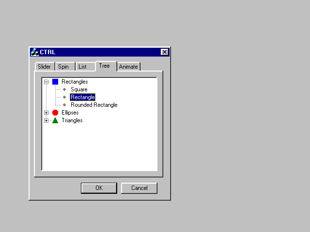
Tree Control
A tree control displays a list of items in a hierarchical form. Three controls are supported in MFC by the CTreeView and CTreeCtrl classes. CTreeView is used by applications that use views that consist entirely of a single tree control.
Tree controls can be added to a dialog template using the Developer Studio dialog editor. For every tree control, a corresponding object of type CTreeCtrl should be created using ClassWizard. It is through this object that the tree control is initialized.
The items in a tree control are set using the CTreeCtrl::InsertItem member function. Tree controls, like their list control cousins, use image lists for displaying icons associated with items. To create an image list, use the class CImageList.
Tree controls send notification messages to their parent window. For example, when an item in a tree control is selected, the tree control sends a TVN_SELCHANGED notification.
Figure 22.8 demonstrates the use of a tree control in the CTRL application. This control was added to the application's dialog using the Developer Studio dialog editor. Three style settings (Has buttons, Has lines, Lines at root) were set to enable the display of lines and expand buttons within the control.
Figure 22.8. A tree control in CTRL.
The control is initialized in the CCTRLDlg::OnInitDialog member function (Listing 22.13).
PSTR pszTreeRoots[] = {"Rectangles", "Ellipses", "Triangles"};

m_cTree.SetImageList(&m_cImageList, TVSIL_NORMAL);

HTREEITEM rootitems[3];

for (i = 0; i < 3; i++)

    rootitems[i] = m_cTree.InsertItem(TVIF_PARAM | TVIF_TEXT |

                                      TVIF_IMAGE |

                                      TVIF_SELECTEDIMAGE,

                                      pszTreeRoots[i], i, i, 0, 0,

                                      -1, TVI_ROOT, TVI_LAST);

for(i = 0; pszListItems[i] != NULL; i++)

    m_cTree.InsertItem(TVIF_PARAM | TVIF_TEXT | TVIF_IMAGE |

                      TVIF_SELECTEDIMAGE, pszListItems[i], 3, 3,

                      0, 0, i, rootitems[nListTypes[i]], TVI_LAST);
The CTRL application handles notification messages from this tree control. When an item in the tree control is selected, the handler for TVN_SELCHANGED messages sets the selection state of the corresponding item in the application's list control. This handler function is shown in Listing 22.14.
void CCTRLDlg::OnSelchangedTree(NMHDR* pNMHDR, LRESULT* pResult)

{

    NM_TREEVIEW* pNMTreeView = (NM_TREEVIEW*)pNMHDR;

    // TODO: Add your control notification handler code here

    int i = m_cTree.GetItemData(m_cTree.GetSelectedItem());

    if (i != -1)

        m_cList.SetItemState(i, LVIS_SELECTED, LVIS_SELECTED);

    *pResult = 0;

}
Summary
The Microsoft Foundation Classes Library provides extensive support for the common dialogs and common controls that are available in Windows.
Common dialog support is available through a series of classes that are derived from CCommonDialog. These classes encapsulate the functionality of the Windows common dialogs, and provide easy ways to set up, display, and process such dialogs. Specifically, the following dialogs are supported:
- Color selection dialogs are supported through the CColorDialog class.
- File Open and File Save As dialogs are supported through the CFileDialog class.
- Find and Replace dialogs are supported through CFindReplaceDialog.
- Font selection dialogs are supported through the class CFontDialog.
- Page setup dialogs are supported through CPageSetupDialog.
- Print and Print Setup dialogs are supported through CPrintDialog.
In addition, a variety of classes derived from COleDialog support OLE-related common dialogs.
Common controls are a new feature of Windows, introduced with Windows 95. Common controls drastically enrich the set of controls available for application programmers for use in dialogs and views.
The type of common controls and the form of support MFC and the Developer Studio dialog editor offer for these controls are summarized in Table 22.1.
Control Type |
Control Class |
View Class |
In Dialog Editor? |
|
Animation control |
CAnimateCtrl |
Yes | |
|
Header control |
CHeaderCtrl |
No | |
|
Hot key control |
CHotKeyCtrl |
Yes | |
|
List control |
CListCtrl |
CListView |
Yes |
|
Progress Bar |
CProgressCtrl |
Yes | |
|
Rich text edit control |
CRichEditCtrl |
CRichEditView |
No |
|
Slider control |
CSliderCtrl |
Yes | |
|
Spin button |
CSpinButtonCtrl |
Yes | |
|
Status window |
CStatusBarCtrl |
No | |
|
Tab control |
CTabCtrl |
Yes | |
|
Toolbar |
CToolBarCtrl |
No | |
|
Tooltip |
CToolTipCtrl |
No | |
|
Tree control |
CTreeCtrl |
CTreeView |
Yes |
Additional rich text edit control support is provided in the form of the CRichEditDoc and CRichEditCntrItem classes. Through these classes and CRichEditView, applications can be constructed that manage rich text documents.
More integrated support for toolbars and status windows is provided in the form of the CToolBar and CStatusBar classes. These classes integrate toolbars and status bars with MFC frame windows.
Popular Tutorials
-
 MS Access
1109
MS Access
1109
-
 C++
1222
C++
1222
-
 HTML
584
HTML
584
-
 JavaScript
616
JavaScript
616
-
 Vbscript
873
Vbscript
873
-
 Oracle
473
Oracle
473
-
 VC++
875
VC++
875
-
 SQL
2959
SQL
2959
-
 XML
514
XML
514
-
 Java
814
Java
814
-
 Perl
455
Perl
455
-
 Linux
451
Linux
451


