Web based School
|
An effective user interface for your web site can mean the difference between
a highly used web page and one that is banished to a desert to die a slow and painful
death. Images and multimedia are important aspects of your web pages. ToChapter's lesson
concentrates on three specific tools that help you create and manage images and multimedia
files. These products are included with Visual InterDev as separate applications.
The images and multimedia files that you create can be integrated into your Visual
InterDev projects. A majority of toChapter's lesson focuses on composing images. You will gain an understanding
of Image Composer and learn how it uses sprites to enable you to interact with objects
and images. You will then discover all of Image Composer's features. During this
part of the Chapter, you will discover how to use Image Composer to create professional
and visually appealing images. You also will learn how to vitalize your images and
make them come alive on your web pages. Later in the Chapter, the lesson teaches you how to compose music and sounds using
Music Producer. In this section, you will receive a definition of Music Producer,
an overview of its features, and a tour of how to use Music Producer to create sounds
and musical compositions. Once you have created multimedia and images, you need a way to manage these files.
The Media Manager provides support for managing a range of multimedia files. Toward
the end of the Chapter, the lesson focuses on the Media Manager and how you can use this
tool to properly organize your files. The last section of the Chapter is crucial, because it shows you how to integrate
your results into your Visual InterDev applications.
Images are an extremely important part of your web page. Images help invigorate
the web page and enhance the user experience. Image Composer provides the tool you
need to create exciting and graphical images that enrich the look of your web pages. Image Composer, first included as a part of the bonus pack with FrontPage 97,
enables you to create and compose images as well as customize existing images for
your web pages. You also can use your images for other uses like presentations. Image
Composer provides a comprehensive environment in which to construct your images into
compositions. New Term: A composition is comprised
of an image or a group of images. When you work with images within the Image Composer
environment, you save your workspace as a composition. Image Composer is a separate application included with Visual InterDev. You can
easily integrate the images that you create with Image Composer into your Visual
InterDev project. Image Composer supports many of the industry file formats for images,
including GIF, JPEG, TIFF, BMP, and Adobe Photoshop files. The major design aspects
of Image Composer combine powerful features with ease of use. You don't have to be a professional graphic artist to use the features of Image
Composer. If you have used other graphics packages, you will be able to transfer
that knowledge to the Image Composer environment. Many tool palettes are provided
to help you during the creation of your images. Image Composer supplies many images
and enables you to create your own. You can even use the Impressionist plug-in to
apply special effects to your images. Image Composer also supports the use of Kai's
Power Tools and Adobe Photoshop plug-ins. Image Composer combines a non-intimidating, user-friendly editor with very robust
features for composing images. Before you discover more about these powerful features,
you need to understand the concept of sprites.
Every image that you insert or create using Image Composer is considered a sprite. New Term: A sprite is an image that
has a defined shape. In other words, the shape of the object is the image. Sprites
have a transparent background; therefore, the shape of the sprite is defined by the
part of the sprite that isn't transparent. Image Composer differs from other graphical software tools by enabling you to
interact with the actual shape of the object. With other tools, you work with the
image and its standard rectangular background. Figure 6.1 depicts the shape of an
image using a tool that doesn't support sprites. A standard image object. In contrast, a sprite has a transparent background. A sprite is represented by
four channels: red, green, blue, and alpha. New Term: A channel provides the method
for color to be transferred to a computer monitor display. Each pixel in an image
is defined by a channel. These four channels are sometimes called RGBA channels. The first three channels
determine the mix of colors for your sprite. You can use the basic colors of red,
green, and blue to adjust the color of your sprite, or combine these colors to produce
a variety of others. The alpha channel defines the transparency of the sprite. You
can adjust the alpha channel for a sprite on a scale of zero to 100 percent. A lower
alpha channel percentage causes the sprite to become more transparent. An alpha channel
of 100% makes the sprite completely opaque, or non-transparent. A sprite. In Figure 6.2, notice that the sprite is selected and is surrounded by a box with
many arrows. This box is called a bounding box. New Term: A bounding box defines and
outlines the shape of the sprite. The bounding box in Figure 6.2 contains handles indicated by arrows. Each of the
arrows on the bounding box represent handles that you can use to manipulate the size
and shape of the sprite. Based upon what you are doing, the bounding box may contain
different types of handle indicators. For example, if you're painting the object,
each handle is denoted by a paintbrush. The stack determines the order in which the sprites appear in your composition.
New Term: The stack, or z-order, refers
to the numerical order of each sprite in a composition. The stack reflects the property
of depth for a composition. Each sprite is designated by a stack number that determines
where it displays in relation to other sprites within a composition. When you add
or create a sprite to your composition, Image Composer places this object on the
top of the stack. The stack is numbered from front to back, so the object assigned
the number 1 is on top of the stack of objects. The sprite with the number 2 is displayed
next, and so on. You can change the stack order of the sprites in your composition.
The stack makes the process of moving images a lot more intuitive. Figure 6.3 illustrates
the concept of the stack for a group of sprites. Visualizing the stack. Sprites are a new and powerful concept. This new and intuitive approach to working
with objects should make your life easier when you create images for your web pages.
Image Composer contains many robust and powerful features that enable you to manipulate
your sprites and compositions. This section gives you an overview of those features
and explains their potential.
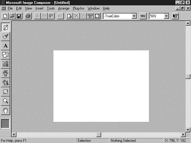
Image Composer provides a new and flexible workspace in which you can interact
with your images. Figure 6.4 displays the main workspace to construct your images. Image Composer's environment. There are two distinct areas of the Image Composer environment: the Composition
Guide and the Extended Workspace. The Composition Guide is the main working area
of Image Composer workspace. The size of this working area can be easily adjusted.
The images that are placed within the Composition Guide area are included in your
composition when you save the file. The Extended Workspace serves as a scratch pad
area. You can move different sprites to this area until you're ready to include them
in your composition. Sprites that are in this area aren't included in the composition
but are saved in the file. You can use the Composition Guide and the Extended Workspace to develop your composition
in stages and preview the results in your web page. For example, you could insert
three images, placing two of the sprites in the Composition Guide and the other sprite
in the Extended Workspace. All three files are included in the file when it is saved.
When you integrate this composition in your web page, the only sprites that are displayed
on the web page are the two sprites that were included in the Composition Guide.
Later, when you're ready to include the third sprite in your composition, you can
easily access it from the Extended Workspace and move it to the exact position within
the Composition Guide. This process can help you rapidly develop your compositions
and test them through an iterative process. Another area on the workspace is the Toolbox, which is located to the left of
the main workspace. You use these tools to change specific attributes related to
a particular sprite. The toolbar area at the top of the workspace displays standard tools that are
available to interact with files. The toolbar also includes some options that relate
to changing the properties of the objects and the workspace. The status bar area at the bottom of the workspace indicates information about
the workspace as well as the sprites that are located within the workspace. The left
part of the status bar displays help information, including the names of tools as
the mouse passes over them. The middle part of the window shows information about
a selected sprite, including x and y coordinates, height, and width. The far right
area of the status bar displays the x and y coordinates of the cursor.
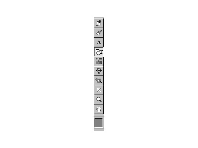
The Toolbox includes many tools for you to alter the different characteristics
of sprites with, including the arrangement, shapes, colors, patterns, and effects.
The Toolbox is displayed to the left of Image Composer's workspace. Figure 6.5 depicts
the options that are available from Image Composer's Toolbox. Using the Toolbox. The first eight tools on the Toolbox focus on changing specific characteristics
of a sprite. The next two, Zoom and Pan, enable you to change aspects of the workspace.
The last option can be used with the other tools to pick various colors for your
sprites. When you select most of the tools, a palette is displayed on the workspace.
This palette represents features specific to the tool, which you can configure. The
following section presents each of the available tools and their purpose.
The Arrange tool enables you to arrange and resize the shape of a sprite. You
also can rotate and flip the sprite. The Apply push button enables you to instantly
view the desired effect. The Arrange Palette offers a feature to crop or extend the
bounding box for the image. You can use buttons that enable you to establish a home
position for the object, and once this position is established, you can move the
sprites around and then return the sprite back to this default position. You also
can lock the position of the sprite. An object that's locked can't be moved until
it's unlocked.
The Paint option enables you to paint a particular color on the sprite using various
tools including a paintbrush, an airbrush, a pencil, and other types of applicators.
You can precisely paint the pixels as well as smear and spray the color onto the
sprite.
Using the Text option, you can create text sprites for your compositions. Image
Composer provides many different fonts to choose from to format your text.
The Shapes tool enables you to create both structured and free-form shapes. You
also can extract the color and texture of a sprite and apply that to another sprite
object.
Using Patterns and Fills, you can add various patterns and fill colors to your
sprites and can transfer colors from one sprite to the other. You also can use the
Gradient Ramp to design a blended color to apply to your sprites. With this feature,
you can choose a combination of up to four colors.
Warps and Filters enables you to add unique effects to your sprite. You can choose
from different warping effects and outlines, including shadows and edges. Filters
enable you to change the display of the sprite. For example, you can change the sprite
to appear blurry. Color enhancements manipulate the color of the sprite. For instance,
you can select Wash to cause the sprite to appear more transparent.
Art Effects provides very robust features to transform you into a graphic artist.
You can apply these effects to your images to create professional-looking images.
The artistic styles include three specific mediums to apply to your sprite:
You can use the Color Tuning option to alter the color attributes of the sprite
like contrast, hue, and brightness. You also can adjust the four channels of the
color of the sprite.
The Zoom option pertains to the view of your composition in the workspace. You
can place your cursor on a certain area of the Composition Guide to magnify, or zoom
in on, the selected area. This feature can be very helpful when you want to view
or change very fine details of a sprite. The Pan tool is in the shape of a hand and
enables you to drag a sprite to different areas of the workspace.
The Color Picker displays a selected color for a sprite. You can choose from many
different colors. You can drag the current color that is displayed on the Color Picker
to the color swatches that are displayed on some of the tool palette options. For
example, if you use the Warps and Filters tool and choose the shadow option from
the tool palette, you can drag the color from the Color Picker to the Color box on
the palette. Conversely, you can drag the color from the Color box on the palette
to the Color Picker, thereby changing the color of this tool.
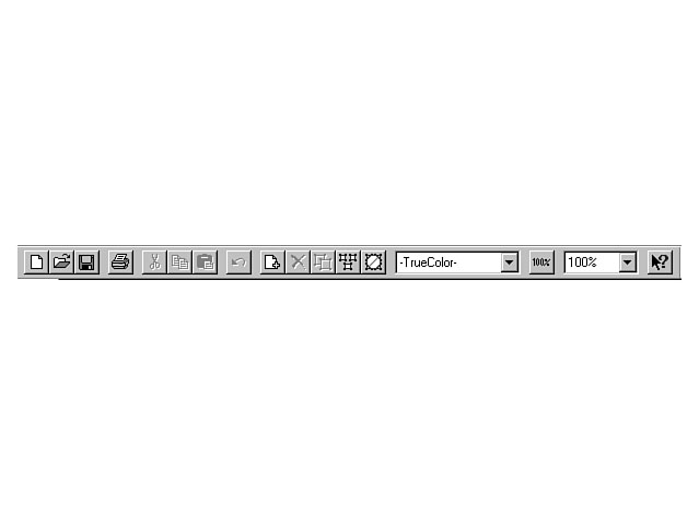
The toolbar provides standard options for working and interacting with individual
sprites and Image Composer workspace. Figure 6.6 displays a close-up of the available
toolbar options. Image Composer toolbar. The first four toolbar options concern file operations. These items enable you
to create a new composition as well as open, save, and print the current composition.
The next four toolbar items provide standard editing features including Cut, Copy,
Paste, and Undo. The last five tools on the toolbar focus specifically on manipulating sprites
in the workspace. The first icon enables you to insert an image file into the current
composition. When you press this button, the Insert Image File dialog window display
enables you to choose an image file to insert into the composition. The next icon
deletes a selected sprite within the workspace. You can use the Duplicate tool to
duplicate a sprite and its properties and copy it to the workspace.
This option saves a step from the traditional two-step process of copying an object
to the clipboard and pasting it to the workspace. You can select all of the sprites
in Image Composer workspace by pressing the Select All option. The next icon clears
the current selection. The Color Format combo box displays the available color palettes for the composition.
Color palettes are covered in the section "Creating a Composition." The
Actual Size button restores the size of the composition to its full size. You can
use the combo box to the right of this button to increase or reduce the size of the
current composition.
As you can see, Image Composer provides a very robust set of features. This part
of the lesson focuses on how to use some of the more relevant features to create
your images. While this won't be an exhaustive tour of all of Image Composer's functions,
the basics are covered to get you started. You can then venture out on your own and
explore other Image Composer features based upon this foundation.
The first building block you need to learn involves working with compositions.
Remember, the composition includes those sprites that are located within the Composition
Guide. When you open Image Composer, a new workspace is displayed. This workspace
consists of the Composition Guide and the Extended Workspace, which you learned about
earlier. The basic component of a composition is a sprite. You can insert an existing image
into the composition or use Image Composer to create a new sprite. Existing images
can be included in your composition in one of two ways. The first method involves
using the Open menu item from the File menu. The second way to insert a sprite into
your composition is to use the Insert menu. The following sections explore both of
these alternatives.
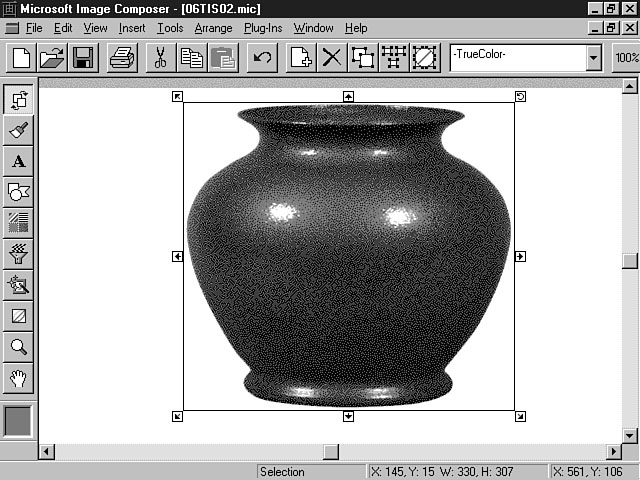
Table 6.2 denotes the file formats that Image Composer enables you to open and
save.
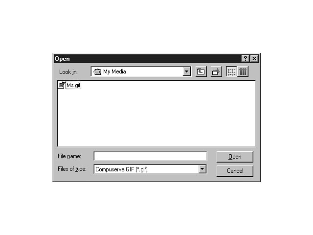
You can open an image by selecting Open from the File menu. This action displays
the Open dialog window. From this window, you can open any of the image file types
specified in Table 6.2. Figure 6.7 demonstrates the capability of the Open dialog
window. Opening an image. Once you have selected a file, Image Composer creates a new workspace for this
image. To save a composition, you can choose Save from the File menu, which saves
the file to the default format of the image. You also can save images to one of the
other supported formats by using the Save As menu item.
The Save Selection As menu option enables you to save the currently selected object.
This object can reside anywhere within the Image Composer workspace, including the
Composition Guide and the Extended Workspace. Figure 6.8 depicts the available options
on the Save Selection As dialog window.
Saving a selected sprite. Figure 6.8 shows the many options available for saving a selected sprite. These
options are enabled or disabled based on the file type that you select in the Save
as type combo box. The top section of this dialog window is pretty self-explanatory.
I will briefly describe the options in the bottom section, starting with the Color
format combo box. This option indicates the color palette for the image file. The
default is TrueColor, which represents a 24-bit color palette. Other choices for
the color palette include Balanced Ramp, Gray Ramp, and Black and White. You also
can create your own custom 8-bit color formats. Once you select a color palette,
a description of this palette is displayed to the right of the Color format combo
box.
The Write Alpha checkbox preserves the alpha channel along with the other three
channels in your image. Remember, the alpha channel depicts the amount of transparency
that an object contains. When you select this option, the Write Premultiplied Alpha
becomes enabled. Image Composer calculates a pre-multiplied alpha along with the
other red, green, and blue channels. The Alpha as color checkbox enables you to assign
a color for the transparency characteristics of the object. By default, an image
that is transparent assumes the color of the background object. This object could
be another sprite or the Composition Guide. If you select the Alpha as color option,
you can establish a color for the image's transparency attributes. The color swatch
to the left of this option enables you to choose a color. The Compression checkbox enables you to reduce the size of the image file. You
can use the Amount slider and edit box to the right of this option to adjust the
compression ratio. A high number reduces the size of the file, but also lowers the
quality of the image. The Amount slider and edit box are enabled for JPEG file formats. The Threshold slider and edit box relate to the Alpha as color option. If you
select a color for a sprite's alpha channel, you can specify the transparency threshold
for all pixels on the image. The threshold determines what pixels will display the
transparency color. A pixel that has a transparency level below the threshold amount
displays the transparent color, and a pixel that has a transparency level above the
threshold level appears opaque and doesn't display the transparency color.
Another way to include sprites in your compositions involves the Insert menu.
You have two options for inserting images using Image Composer. First, you can insert
an image from a file. Choose the Insert menu and select the From File option. The
Insert From File dialog window is displayed, enabling you to choose the desired image
file. When you press the OK button, the image is inserted as a sprite into your composition.
The other option is to insert the image from a PhotoCD. This option is specifically
designed for photographs that have been created using the Kodak PhotoCD discs. Other
PhotoCD formats can be used by choosing the From File option.
You can choose the Composition Properties menu item from the File menu to change
the properties related to a composition. The Composition Properties dialog window
enables you to view the properties for the composition as well as change the size
and color of the composition. Figure 6.9 displays the properties for a sample composition.
The Composition Properties dialog window.
The Composition Properties dialog window has two tabs: Composition and Annotations.
Composition is the default display tab. The first two fields in this view enable
you to see and change the height and width of the composition. The picture to the
right of these fields provides a thumbnail version of the composition. The next section
on this tab displays the color properties of the composition. You can't alter these
fields. The Color space field indicates the method for representing the colors of
the sprite. In Figure 6.9, the method for representing the colors is RGB, which means that
a combination of red, green, and blue were used to achieve the desired color for
the sprite. Other available methods include HWB and HSV. HWB uses a mix of hue, whiteness,
and blackness to achieve a color, while HSV uses hue, saturation, and value to produce
the desired color. New Term: Hue defines the frequency
of light waves that pass through an object. The hue distinguishes one color from
another. You can adjust the hue using the Color Tuning Palette. New Term: Saturation refers to the
amount of gray that is reflected in the color. The Has alpha field indicates whether the sprite includes a transparency channel.
The Num. channels field denotes the number of channels that are being used by the
composition. The maximum value for this field is 4. The Bits per channel field shows
the number of bits that are used per pixel to display the color of the composition. The Composition Guide Color section enables you to view and alter the colors for
the composition's background. The default is white, represented by the values of
255 in the Red, Green, and Blue fields. To change the background color of the composition,
click on the color swatch to the right of these fields. The Color Picker dialog window
is displayed, enabling you to choose the desired color. You also change the individual
numbers of the Red, Green, and Blue fields for those of you who like to paint by
numbers. The color swatch change is based on the combination of red, green, and blue
that you choose. The Sprites list enables you to see the individual sprites that make up the composition.
You can view an individual sprite's properties by double-clicking on an item in the
list. You also can select the item and choose the Properties item from the shortcut
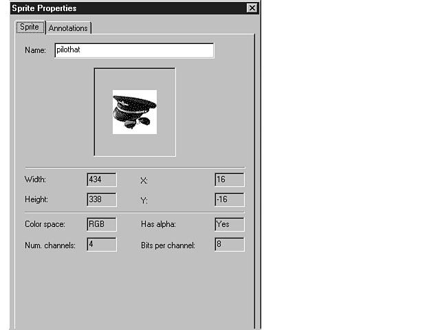
menu. Figure 6.10 shows the properties for an individual sprite within a composition. From the Sprite Properties dialog window, you can view the properties for the
selected sprite, including height, width, x and y coordinates, and color properties.
You can change the name of the sprite from this window. You can press the Apply push button at the bottom of the Composition Properties
dialog window to see the effects of your changes. If you like the changes, press
the OK button to confirm the modifications. Press the Cancel button to negate the
proposed changes. The Annotations tab enables you to view and document changes to the composition.
You can record specific types of updates and changes including the person responsible
and the date of the change. The Annotations database can help you organize your workgroup
by documenting the composition process. The Sprite Properties dialog window.
Image Composer supports the use of scanning device and digital cameras that are
based on the industry-standard TWAIN interface to insert sprites into a composition.
To scan an image into a composition, select Scan from the File menu. A sub-menu is
displayed, revealing two options. Choose the Select Scan Source menu item and pick
the scanner that you're going to use. After confirming this choice, select the Acquire
Scan item from the Scan sub-menu. Image Composer begins importing your image.
So far, you have been introduced to the many features of Image Composer. You have
learned about the different techniques to work with sprites to create a composition.
In this section, you get a chance to create your own composition. Not every option
and feature are covered, but you will discover how to use sprites and various colors
and effects within Image Composer to construct dynamic compositions.
The first step in building a composition is creating a sprite. The following instructions
guide you through this process. Make sure that you set the Zoom Percent to 50%.
You have just created your first sprite. First, you selected a color for the sprite
by using the Color Picker. You can use either the True Color tab or the Custom Palette
for choosing colors. In the example, you entered values directly into the Red, Green,
and Blue fields. The Custom Palette tab enables you to select from a choice of 256
colors. Figure 6.11 shows the Color Picker dialog window using the True Color display
tab. The Color Ramp shows the true color options and is located on the left-hand side
of the dialog window. There are two handles that surround the Color Ramp. The top
handle changes the hue, and the left handle adjusts the amount of blackness that
is mixed with the hue. The Whiteness Ramp is to the right of the Color Ramp. The right handle to the
side manipulates the amount of whiteness that displays in the color. Choosing the true colors. The New Color to use box appears in the upper right-hand corner of the dialog
window, and depicts the original color of the swatch in the left half of the box,
along with the new color that you create in the right half. The sections below the New Color box enable you to choose and manipulate the Color
Space model. You can choose either the RGB (Red, Green, and Blue) or the HSV (Hue,
Saturation, and Value) model. The slider bars and edit boxes change, based on the
model that you choose. The eyedropper located below the Color Space sections enables you to pick a color
from your desktop. In other words, you can choose colors outside of the Image Composer
environment. To use this feature, click on the eyedropper button, choose a color
on the desktop that you want, and click the mouse again. The selected color displays
in the New Color to use box as you move the cursor over different colors on your
desktop. As you move the cursor, the box to the right of the eyedropper shows the
x and y coordinates of the eyedropper. You also can select an average of several
colors by clicking the eyedropper and then drawing a rectangle around an area that
contains the desired colors.
After designing the right color, you use the Shapes Palette to construct a rectangle,
and you change the color of the rectangle to gray. You then cut out a portion of
the rectangle by drawing a rectangle shape inside the existing rectangle and pressing
the Erase button. Figure 6.12 depicts the Shapes Palette. Drawing a shape.
The Shapes Palette contains several shapes located on the left-hand side of the
window that you can construct. The first shape is the rectangle shape, which you
used in the example. The other shapes include the oval, spline, and polygon.
The Color Lift button is located below the polygon on the Shapes Palette. This
button enables you to lift, or duplicate, the color of an existing sprite. You can
use this feature by selecting a sprite and pressing the Color Lift button. The mouse
cursor changes to a thin paintbrush. Position the cursor over the desired area and
color within the currently selected sprite and click the paintbrush. Press the Render
button on the Shapes Palette to create the duplicate sprite. The next two sections on the Shapes Palette are used in conjunction with the shapes
to the left and the three push buttons to the right of these sections. The first
section enables you to set the opacity for rendering, extracting, and erasing sections
of existing sprites. Remember, opacity refers to the amount of transparency the object
contains. A value of 100 percent means that the sprite is completely opaque, or non-transparent.
You can use the slider bar or edit box to change the opacity value. A good example
of how to use this value involves duplicating an existing section of a sprite. You
can create a copy of a section of an existing sprite by selecting a shape and drawing
that shape over an area of the desired sprite. By adjusting the opacity value, you
can adjust the amount of transparency that the new sprite picks up from the existing
sprite. The Spline and Polygon Defaults section contains options specifically for the
spline and polygon tools. The Close checkbox indicates whether spline curves will be opened or closed. The Fill checkbox enables you to fill the spline or polygon with the current color
in the Color Picker and the opacity value specified on the Shapes Palette. This option
can only be checked when the Close checkbox is selected. The next part of the Spline and Polygon Defaults section enables you to designate
the width of a spline. You can use the Edit Points button to edit the points of a
polygon or spline. The Recall Spline button recalls and enables the last spline that
was drawn. The Render button confirms an action for the Shapes Palette. The Extract button
enables you to extract the shape and color of an existing sprite. The Erase button
enables you to erase a designated section of an existing sprite based on the shape
that you select. For example, during the previous exercise, you could have chosen
a circle to erase part of the existing rectangle. This action would have formed the
shape of a circle instead of a rectangle to display within the existing sprite. The
Sticky checkbox preserves all of the custom settings for the shape tools.
Earlier toChapter, you learned how to insert an image into an existing composition.
The next part of the lesson focuses on inserting several sprites from the Visual
InterDev samples.
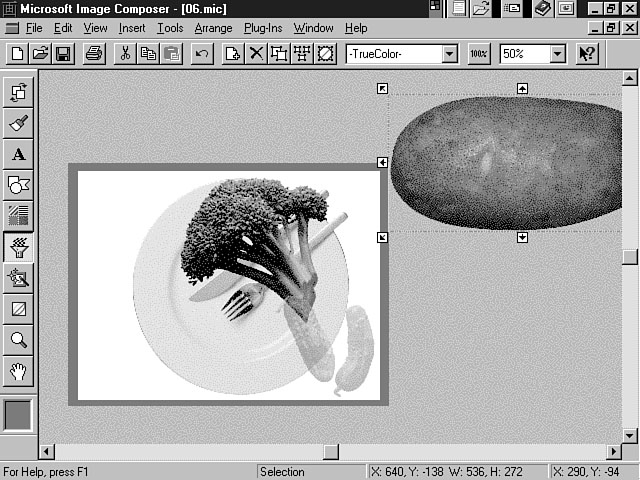
You have now learned how to insert and interact with multiple sprites. In this
part of the lesson, you have discovered how to use the Shapes Palette to move and
size your sprites as well as how to use the Patterns and Fills tool to create a transparent
sprite. Your Image Composer workspace should look like the workspace pictured in
Figure 6.13.
In this section, you discover how to paint sprites and use art effects to enhance
the look of your composition. The following instructions direct you through this
process:
\Client\Imgcomp\Mmfiles\Photos\Plants\Banana1.mic
A transparent sprite.
In this exercise, you were able to use the Paint and Art Effects tools to customize
the look of your sprites. Both of these tool palettes offer many options to choose
from. You can use the Paint Palette to alter the color of a sprite. The Paint Palette
tools include a Paintbrush, an Airbrush, a Pencil, and an Eraser. Each of these tools
enables you to paint a certain type of desired effect onto the sprite. For example,
you can use the Pencil to draw very detailed lines around a sprite. Other tools on
the Paint Palette provide painting effects, such as creating a smudged, impressionist
look. You also can choose the size and opacity of the tool as well as create and
use templates from this palette. The Art Effects Palette enables you to use the effects of three different categories
of art to produce a desired effect. The three categories include Paint, Sketch, and
Graphic. The Paint category consists of various painting effects like watercolor
and sponge painting. The Sketch category pertains to drawing and includes effects
such as charcoal and pastel. You can use the Graphic category to produce an effect
to make it look like a sprite was created from stained glass. Two other Art Effects categories include Exotic and Utility. You used the Exotic
art effect in the preceding exercise to create glowing edges for the flower. Other
examples of Exotic effects include using plaster, glass, and chrome effects. You
can add texture and 3D effects by using the Utility effects.
To truly learn about all of these features, you should practice with different
sprites and effects. Image Composer provides many options for designing professional-looking
compositions.
Image Composer supports the use of third-party plug-ins like Kai's Power Tools
to further enliven your compositions. In this section, you use the Impressionist
plug-in included with Image Composer.
The Impressionist plug-in enables you to produce some pretty creative and artistic
styles. In this exercise, you used the Impressionist plug-in to change the color
and style of the rectangle frame for your composition. You first chose the Style
button to pick a specific style for the rectangle sprite. The Impressionist plug-in
provides many style categories and options to choose from. Again, you need to experiment
on your own with each of these styles to understand their potential.
Next, you selected the background and color for the brush strokes. The Background
combo box enables you to choose to which background you want the brush strokes applied.
In the exercise, you selected Custom Color. This option enables you to apply the
defined style to the custom color that you select. In other words, the Hot Swirl
style was brushed onto the medium purple color. In contrast, you could have chosen
Image from the Background combo box. This option applies the defined style to the
original image. The Impressionist dialog window enables you to save custom styles and colors that
you define and create.
Animation has become an important part of images and web pages, and users have
come to expect exciting pages that encourage participation and interaction. The Microsoft
GIF Animator provides a great tool for creating animated images.
The GIF Animator is fully integrated with Image Composer. In fact, when you install
the GIF Animator, a menu option is added to the Tools menu. You can use this menu
option to start the GIF Animator from within the Image Composer workspace. Once you
have started the GIF Animator, you can drag and drop your images from the Image Composer
workspace to the GIF Animator environment. The GIF Animator supports the GIF89a file format for animation. This format creates
animation effects by storing timing information about the image.
You can start the GIF Animator by choosing the Tools menu from Image Composer
and selecting GIF Animator from the list. Use the following instructions to guide
you through a tour of the GIF Animator.
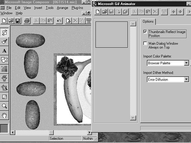
Creating duplicate sprites.
You are now ready to insert these sprites into the GIF Animator.
Dragging images into the GIF Animator.
Now you're ready to customize the sprites using the features of the GIF Animator.
The GIF Animator environment is pictured in Figure 6.16. As you can see in Figure 6.16, the GIF Animator environment consists of a series
of frames on the left-hand side and a tab display on the right. The potato sprites
are positioned in each of the four frames. The tab display choices are Options, Animation,
and Image. The Options tab enables you to set parameters regarding the management
of your images. The Animation tab enables you to configure the animation settings
including the size, duration, and transparency attributes. You can use the Image
tab to set properties for an individual image. Taking a closer look at the GIF Animator. I want to point out some of the features on the Animation tab. The Height and
Width fields enable you to set the size of the frame in which the animation is displayed.
The GIF Animator presents a default display that can be changed. The Image Count
field indicates the number of frames included in the current animation. You can use
the Looping checkbox to repeat your animation. When you check the Looping option,
the Repeat Count and the Repeat Forever fields become enabled. Repeat Count enables
you to repeat your animation a specified number of times. Repeat Forever provides
continuous animation. The Trailing Comment text box enables you to provide a comment
for the animation. You can use the Image tab to configure settings for all of the
images by selecting all of the frames and then using the options within this tab.
To select all of the frames, click on the Select All button. This option is located
next to the Move Up Arrow on the toolbar menu. You also can use the Shift key and
the left mouse button to select the frames.
Follow these instructions to establish the animation settings.
You have now learned the basics of using Image Composer to create professional
looking graphics. You also discovered how to create animation for your sprites by
using the Microsoft GIF Animator. This part of toChapter's lesson has only touched the
tip of the iceberg concerning the ability of these tools. I would encourage you to
continue practicing and experimenting with the many features that these tools have
to offer.
Sounds and music also are a very important part of an interactive web site. Many
web pages are using background sound and other types of music to provide an enjoyable
experience for the user. This section switches gears and focuses on how to integrate
music and sounds into your applications.
Now that you have had the chance to play the role of a graphic designer, you're
ready for your next career in life. The Microsoft Music Producer makes you a musician
in no time at all. Music Producer enables you to create compositions that consist
of different keys, styles, tempo, personalities, and instruments. A composition also
conforms to a specific shape that defines the instrument activity. New
Term: Shape in the context of a musical composition refers to the
overall pattern of the instruments and the music. Music Producer uses the Microsoft
Interactive Music Engine to translate your instructions to music and sounds. You
can create MIDI compositions as well as Microsoft Music Producer (MMP) compositions.
MIDI compositions are ideal for web pages because of the relatively smaller file
size when compared to other audio compositions, like .wav files. These compositions can be included in web pages and presentations. The best part
about your Music Producer compositions is that they are royalty-free.
Music Producer contains many features for producing high quality music and sounds.
The following sections focus on some of the main features that you will be using
when creating compositions.
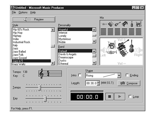
The first step to creating a composition involves understanding the available
music options. The Preview button enables you to listen to your music choices and
adjust the music as needed. Figure 6.17 shows the Preview button and illustrates
the rest of the Music Producer environment. The left side of the Music Producer environment displays a listbox of over 100
musical styles. The style defines the overriding theme of your composition. The key
melodies and rhythm are portrayed through the style. The middle part of the window contains the Personality and Band choices. The contents
of each of these list boxes change based on the style that you select. The personality
determines the mood of the music while the band consists of the musical instruments
that will be used. A band is comprised of up to six musical instruments. When you
select a band, the band's instruments display in the Mix pane on the right-hand side
of the window. Using Music Producer. You can adjust both the balance and the volume of an instrument by dragging the
musical instrument icon. The volume level is depicted vertically in the Mix pane.
For example, if you wanted to increase the volume of an electric guitar, you would
click on its icon and drag the guitar upward. To decrease the volume of the electric
guitar, you drag the icon downward. The balance is defined horizontally. You can
drag an icon to the left or right to adjust the speaker balance of an instrument.
The Meters pane displays the volume level for each instrument and reflects any changes
you make to a musical instrument's volume. You also can adjust the tempo and key for the music. Each style has a default
tempo and key. You can use the Tempo slider bar to adjust the speed of the music.
If you move the slider to the right, the music becomes faster. You can adjust the
slider to the left to create a slower tune. The value for the tempo can range from
10 to 350 beats per minute. The value that you choose using the slider bar is displayed
in the Tempo field above the Tempo slider bar. The key defines the pitch or tone
of the music, and is set by default to C. If you wish, you can adjust this value
using the Key slider bar. The value that you choose is displayed in the Key field.
After you have previewed and experimented with the various musical options, you
need to create your own composition. The Compose area provides the tools you need
to construct your composition. Figure 6.18 depicts the Compose area of Music Producer. Composing the music. To create a composition, click on the Compose push button. You can then select
different attributes for your composition. You can use the Intro and Ending checkboxes
to create a distinct beginning and closing for your composition. The Shape combo
box provides several options for defining the pattern and number of musical instruments
that play throughout the composition. Available options include creating a rise or
fall in the musical level as well as defining a peak in the middle of the composition. You need to set a length for your composition by using the Length field. You must
enter the length in terms of minutes, seconds, and tenths of a second, or MM:SS:T. You can use the Playback controls to play, pause, or stop your composition before
you save it. The Loop checkbox can be used to continuously repeat a composition during
playback.
The final step in the creation of a composition is to save the file. You can save
this file either as a MIDI or MMP composition. The default is the MMP format.
In this lesson, you have learned how to create images, sounds, and music to enhance
the look of your web pages. You have discovered the power of Image Composer and Music
Producer and gained a good understanding of the features of these applications. The images that you create using Image Composer can easily be inserted into your
Visual InterDev project. After you save an Image Composer composition, you can open
your Visual InterDev project and add the file to the project. You can then insert
the image into your HTML web page, or insert the image visually using the FrontPage
Editor for Visual InterDev. The process is similar for your musical compositions that you create using Music
Producer. Typically, you create a musical composition and include the music as background
sound for your web page. Again, you can include the file in your project and code
the HTML using the Source Editor, or you can use a visual tool like the FrontPage
Editor to insert the file into the page.
Visual InterDev includes some very robust tools for creating multimedia effects
for your web pages. Image Composer provides an excellent environment for producing
very artistic and graphical image compositions. Likewise, Music Producer enables
you to create rich and exciting musical compositions to spice up your web pages. During the first part of toChapter's lesson, you gained an understanding of Image
Composer and its features. You learned about the various tools and options that you
can use to construct your compositions. You then took a guided tour of how to work
with sprites to create an Image Composer composition. You inserted several sprites
and used some of the painting and artistic palettes to produce a desired effect.
You also learned how to use the Microsoft GIF Animator to make your images come alive. The latter part of the Chapter was spent learning how to use Music Producer. You learned
about Music Producer's features and how to create a musical composition. This lesson has provided you with just a taste of the power of Image Composer
and Music Producer. The compositions that you create using each of these tools can
easily be integrated into your Visual InterDev projects. You were able to put on
a more creative and artistic hat for toChapter's lesson. Tomorrow, you will put your
developer hat back on as the lesson focuses on client-side script.
In the lesson toChapter, you created a composition using Image Composer and learned
how to interact with sprites. In the following workshop, you experiment some more
with both Image Composer and Music Producer. You can use the Image Composer composition
that you created, or you can create a new composition. You should practice using
each of the Image Composer tool palettes to really get a feel for their capability. You also should practice using Music Producer to create some musical compositions.
You should focus on using the various styles, personalities, and bands as well as
adjusting the tempo and key.
|
||||||||||||||||||
|
|


Popular Tutorials
-
 MS Access
1109
MS Access
1109
-
 C++
1222
C++
1222
-
 HTML
584
HTML
584
-
 JavaScript
616
JavaScript
616
-
 Vbscript
873
Vbscript
873
-
 Oracle
473
Oracle
473
-
 VC++
875
VC++
875
-
 SQL
2959
SQL
2959
-
 XML
514
XML
514
-
 Java
814
Java
814
-
 Perl
455
Perl
455
-
 Linux
451
Linux
451

